4. New Widgets
4.1. AccelLabel
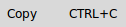
A label which displays an accelerator key on the right of the text.
Imperative:
>>> import tkinter as tk
>>> import witkets as wtk
>>> root = tk.Tk()
>>> style = wtk.Style()
>>> style.theme_use('clam')
>>> style.apply_default()
>>> a = wtk.AccelLabel(root, labeltext='Copy', acceltext='CTRL+C')
>>> a.pack(expand=1, fill=tk.X, padx=20, pady=20)
>>> root.mainloop()
Declarative:
<root>
    <accellabel wid='lbl-new' labeltext='New' acceltext='CTRL+N' />
    <accellabel wid='lbl-open' labeltext='Open...' acceltext='CTRL+O' />
    <geometry>
        <pack for='lbl-new' />
        <pack for='lbl-open' />
    </geometry>
</root>
Styles:
The following styles affect this widget’s appearance:
MenuEntry.TLabel — main label style
Accelerator.TLabel — accelerator style (defaults to gray)
TFrame — the frame as a whole
- class witkets.accellabel.AccelLabel(master=None, labeltext='', acceltext='', **kw)
A label which displays an accelerator key on the right of the text.
- Parameters
master (object) – Parent widget
- The following options can be used in several ways:
upon construction (e.g.:
widget = Widget(parent, option=value))by tkinter standard
config()method (e.g.widget.config(option=value)) orin a dict-like access (e.g.: widget[‘option’] = value)
- Keyword Arguments
labeltext (str) – Main label text
acceltext (str) – Accelerator text
kw (dict) – All
Framewidget options
- property accel
Label containing the accelerator string.
- config(**kw)
Standard Tk config method
- property label
Label containing the main text.
4.2. CardLayout
Special container that displays only one child at a time.
Imperative:
>>> import tkinter as tk
>>> import tkinter.ttk as ttk
>>> import witkets as wtk
>>> def change_card():
...    cards.next()
...
>>> root = tk.Tk()
>>> cards = wtk.CardLayout(root)
>>> label1 = ttk.Label(cards, text='Some Card')
>>> label2 = ttk.Label(cards, text='Other Card')
>>> cards.add(label1, 'first-card')
>>> cards.add(label2)  # will be named 'card2'
>>> button = ttk.Button(root, text='Change Card')
>>> button.pack(padx=10, pady=10)
>>> button['command'] = change_card
>>> cards.pack(padx=10, pady=10)
>>> root.mainloop()
Declarative:
<root>
    <cardlayout wid='card1'>
        <label wid='label1' text='Some content...' />
        <label wid='label2' text='Other content...' />
        <frame wid='frame1' />
        <geometry>
            <card for='label1' name='first' />
            <card for='label2' name='second' />
            <card for='frame1' />
        </geometry>
    </cardlayout>
    <button wid='button1' text='Change card...' />
    <geometry>
        <pack for='card1' />
        <pack for='button1' />
    </geometry>
</root>
Styles:
The following styles affect this widget’s appearance:
TFrame
- class witkets.cardlayout.CardLayout(master=None, **kw)
Special container that displays only one child at a time.
- Parameters
master (object) – Parent widget
- Keyword Arguments
kw (dict) – All
Framewidget options
- add(widget, name: Optional[str] = None, **pack_options)
Add a card to the layout manager.
- Parameters
widget (object) – Widget to be added as this card. A simple widget or a container, like Frame.
name (str) – Card unique name. If not provided, defaults to card*NUM*. If already used, overrides the previous card.
- first()
Switch to the first card.
- last()
Switch to the last card.
- next()
Switch to the next card, with circular increment.
- previous()
Switch to the previous card, with circular decrement.
- show(name: str)
Switch to a given card specified by its name.
- Parameters
name (str) – Card unique name.
4.3. ColorButton
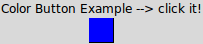
A button to launch a color selection dialog.
Imperative:
>>> import tkinter as tk
>>> import tkinter.ttk as ttk
>>> import witkets as wtk
>>> root = tk.Tk()
>>> ttk.Label(root, text='Color Button Example: click it!').pack(pady=9)
>>> a = wtk.ColorButton(root, color='red')
>>> var = tk.StringVar()
>>> a['textvariable'] = var
>>> var.set('#00F')
>>> a.pack(padx=10, pady=10)
>>> root.mainloop()
Declarative:
<root>
    <label wid='label1' text='Colors:' />
    <colorbutton wid='colorbutton1' color='#800000' />
    <colorbutton wid='colorbutton2'>
        <textvariable name='color2' type='text' value='#008000' />
    </colorbutton>
    <geometry>
        <pack for='label1' side='left' />
        <pack for='colorbutton1' side='left' />
        <pack for='colorbutton2' side='left' />
    </geometry>
</root>
Styles:
The following styles affect this widget’s appearance:
TCanvas
- class witkets.colorbutton.ColorButton(master, color='#CCC', textvariable=None, **kw)
A button to launch a color selection dialog.
This widget mocks GtkColorButton from the Gtk toolkit. It is “a button which displays the currently selected color an allows to open a color selection dialog”.
- Parameters
master (object) – Parent widget
- The following options can be used in several ways:
upon construction (e.g.:
widget = Widget(parent, option=value))by tkinter standard
config()method (e.g.widget.config(option=value)) orin a dict-like access (e.g.: widget[‘option’] = value)
- Keyword Arguments
color (str) – Selected/displayed color
textvariable (object) – Tk
StringVarto stock colorkw (dict) –
Canvaswidget options (notably width and height)
- config(**kw)
Tk standard config method
4.4. ConsoleView
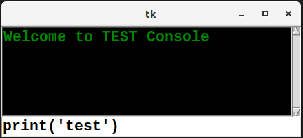
A widget suitable for constructing interactive consoles.
The widget has a primitive emulation of readline, such that vertical arrow keys puts recent commands in the user input entry.
Imperative:
>>> import tkinter as tk
>>> import witkets as wtk
>>> root = tk.Tk()
>>> consoleview = wtk.ConsoleView(root)
>>> consoleview.text['width'] = 32
>>> consoleview.pack(expand=1, fill='both')
>>> consoleview.write_line('Welcome to TEST Console')
>>> root.mainloop()
Declarative:
<root>
    <style>
        [Console.TEntry]
            foreground=blue
    </style>
    <consoleview wid='console1' />
    <geometry>
        <pack for='console1' />
    </geometry>
</root>
Styles:
The following styles affect this widget’s appearance:
Console.TEntry — input entry style
TFrame — the frame as a whole
The main console area is an instance of tkinter.Text. Therefore,
it cannot use ttk-based styling.
- class witkets.consoleview.ConsoleView(master=None, **kwargs)
A widget suitable for constructing interactive consoles.
- property command_entry
Command input entry.
- disable_input()
Disable command input.
- enable_input()
Enable command input.
- focus_input()
Move UI focus to the command entry.
- property last_command
Last command issued to the console.
- property last_input_line
Last line (possibly empty) entered by the user.
Blank lines are neither added to the command history nor accessed through the last_command property.
- property text
Scrolled text (console output)
- write_line(line: str, tags: Optional[list] = None)
Write a line to the console, without interpreting any command.
- Parameters
line (str) – Text to be appended to the console
- Keyword Arguments
tags (list) – List of tags to be applied to the line
4.5. Expander
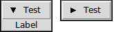
Container capable of hiding its child.
The widget has a primitive emulation of readline, such that vertical arrow keys puts recent commands in the user input entry.
Imperative:
>>> import tkinter as tk
>>> import tkinter.ttk as ttk
>>> import witkets as wtk
>>> root = tk.Tk()
>>> expander = wtk.Expander(root, text='Test')
>>> label = ttk.Label(expander.frame, text='Expanded content')
>>> label.pack()
>>> expander.pack()
>>> root.mainloop()
Declarative:
<root>
    <expander wid='expander1' text='Test 2 (XML)'>
        <label wid='lbl1' text='Contents' />
        <geometry>
            <pack for='lbl1' />
        </geometry>
    </expander>
    <geometry>
        <pack for='expander1' />
    </geometry>
</root>
Styles:
The following styles affect this widget’s appearance:
TFrame — the container as a whole.
Expander.TButton — The expander button for toggling child visibility.
Expander.TFrame — The frame being collapsed or revealed.
- class witkets.expander.Expander(master=None, text='', expanded=True, **kw)
Container capable of hiding its child.
- Parameters
master (object) – Parent widget
- The following options can be used in several ways:
upon construction (e.g.:
widget = Widget(parent, option=value))by tkinter standard
config()method (e.g.widget.config(option=value)) orin a dict-like access (e.g.: widget[‘option’] = value)
- Keyword Arguments
text (str) – The text to be shown in the button
expanded (bool) – Whether the child should be shown (defaults to True)
kw (dict) –
Framewidget options
- property button
The inner Button widget.
- config(**kw)
Standard Tk config method
- property frame
The inner Frame widget
4.6. FileChooserEntry
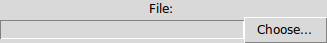
File chooser for open, “save as” and “folder select” operations.
Imperative:
>>> import tkinter as tk
>>> import tkinter.ttk as ttk
>>> import witkets as wtk
>>> root = tk.Tk()
>>> ttk.Label(root, text='Open, save as and select folder: ').pack()
>>> chooser = wtk.FileChooserEntry(root)
>>> chooser['filetypes'] = [('Bitmap', '*.bmp'), ('PDF', '*.pdf')]
>>> chooser2 = wtk.FileChooserEntry(root, buttontext='Escolher')
>>> chooser2['action'] = wtk.FileChooserAction.SAVE
>>> chooser2['dialogtitle'] = 'Salvar como...'
>>> chooser3 = wtk.FileChooserEntry(root,
...     action=wtk.FileChooserAction.SELECT_FOLDER)
>>> chooser3.config(buttontext='Choisir...',
...     dialogtitle='Je veux un dossier')
>>> chooser4 = wtk.FileChooserEntry(root,
...     action=FileChooserAction.OPEN_MULTIPLE)
>>> chooser4['buttontext'] = 'Open Multiple...'
>>> chooser.pack(fill='both')
>>> chooser2.pack(fill='both')
>>> chooser3.pack(fill='both')
>>> chooser4.pack(fill='both')
>>> root.mainloop()
Declarative:
<root>
    <filechooserentry wid='filechooser1' buttontext="Choisir"
                      dialogtitle="Nom du nouveau fichier..."
                      action="save">
        <filetypes>
            <filetype name="PNG Images" pattern="*.png" />
        </filetypes>
    </filechooserentry>>
    <geometry>
        <pack for='filechooser1' />
    </geometry>
</root>
For the declarative approach, the action attribute accepts the following values:
open
open-multiple
save
select-folder
- class witkets.filechooserentry.FileChooserAction(value)
File chooser actions (OPEN, OPEN_MULTIPLE, SAVE or SELECT_FOLDER)
- class witkets.filechooserentry.FileChooserEntry(master=None, textvariable=None, buttontext='Choose...', dialogtitle='Choose...', action=FileChooserAction.OPEN, **kw)
File chooser for open, save as and path select operations.
The chosen path can be accessed either through the
getmethod or by a Tk StringVar via the textvariable option.- Parameters
master (object) – Parent widget
- Events:
<<FilePathChanged>> : fired whenever the user changes the filepath
- The following options can be used in several ways:
upon construction (e.g.:
widget = Widget(parent, option=value))by tkinter standard
config()method (e.g.widget.config(option=value)) orin a dict-like access (e.g.: widget[‘option’] = value)
- Keyword Arguments
action (FileChooserAction) – OPEN, SAVE, SELECT_FOLDER or OPEN_MULTIPLE
buttontext (str) – Text for the “Choose” button
dialogtitle (str) – Dialog window title
textvariable (object) – Tk
StringVarused to store the filepathfiletypes (list) – File types (applies only to OPEN, OPEN_MULTIPLE or SAVE actions). If omitted, defaults to [(‘All files’, ‘.’)]
kw (dict) – Other keywords arguments (
Framewidget options)
- property button
The Choose button.
- config(**kw)
Tk standard config method
- property entry
The entry displaying the selected filename.
- get()
Gets the current selected file path.
4.7. Gauge
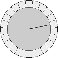
A widget for setting values by rotating a knob.
Imperative:
>>> import tkinter as tk
>>> import tkinter.ttk as ttk
>>> import witkets as wtk
>>> def test():
...     label['text'] = gauge['number']
...     root.after(50, test)
...
>>> root = tk.Tk()
>>> label = ttk.Label(root)
>>> label.pack()
>>> gauge = wtk.Gauge(root)
>>> gauge['width'] = gauge['height'] = 200
>>> gauge.pack(expand=1, fill=tk.BOTH)
>>> gauge.enable_mouse()
>>> root.after(50, test)
'after#0'
>>> root.mainloop()
Declarative:
<root>
    <gauge wid='gauge1' minvalue='0' maxvalue='100' tickcount='8'
           width='96' height='96' startang='30' endang='330'
           knobcolor='red' />
    <geometry>
        <pack for='gauge1' />
    </geometry>
</root>
- class witkets.gauge.Gauge(master=None, number=0, numvariable=None, maxvalue=100, minvalue=0, tickcount=20, startang=- 60, endang=240, knobrelradius=0.75, knobcolor='#CCCCCC', scalecolor='#EEEEEE', tickcolor='#333333', cursorcolor='#333333', cursorwidth=2, **kw)
A widget for setting values by rotating a knob.
This widget is an alternative way of inputting numbers in a range.
- Parameters
master (object) – Parent widget
- Events:
<<FilePathChanged>> : fired whenever the user changes the filepath
- The following options can be used in several ways:
upon construction (e.g.:
widget = Widget(parent, option=value))by tkinter standard
config()method (e.g.widget.config(option=value)) orin a dict-like access (e.g.: widget[‘option’] = value)
- Keyword Arguments
number (number) – The current value
numvariable (object) – Numeric variable to store the current value
maxvalue (number) – Maximum value (proportional to maximum angle)
minvalue (number) – Minimum value (proportional to minimum angle)
tickcount (int) – Number of ticks along the scale
startang (float) – Starting angle
endang (float) – Ending angle (must be greater than startang)
knobrelradius (float) – Knob radius relative to the total radius [0..1]
knobcolor (color) – Knob color (inner radius)
scalecolor (color) – Scale color (outer radius)
tickcolor (color) – Ticks color
cursorcolor (color) – Cursor color
cursorwidth (int) – Cursor line width
kw (dict) – Other keywords arguments (
Canvaswidget options)
- config(**kw)
Standard Tk config method
- disable_mouse()
Disables mouse events
- enable_mouse()
Enable mouse events
4.8. ImageButton

A convenience widget for setting a button with an image.
Imperative:
>>> import tkinter as tk
>>> import tkinter.ttk as ttk
>>> import witkets as wtk
>>> root = tk.Tk()
>>> btn = ImageButton(root, imgfile='myicon.gif', compound='top')
>>> btn['text'] = 'Click me!'
>>> root.mainloop()
Declarative:
<root>
    <imagebutton wid='imgbutton1' imgfile='test.png' text='Test' />
    <geometry>
        <pack for='imgbutton1' />
    </geometry>
</root>
- class witkets.imagebutton.ImageButton(master, imgfile=None, **kw)
A button with an image.
- Parameters
master (object) – Parent widget
- The following option can be used in several ways:
upon construction (e.g.:
widget = Widget(parent, option=value))by tkinter standard
config()method (e.g.widget.config(option=value)) orin a dict-like access (e.g.: widget[‘option’] = value)
- Keyword Arguments
imgfile (str) – Path to the button icon.
kw (dict) – Other keywords arguments (
ttk.Buttonwidget options)
- config(**kw)
Standard Tk config method
4.9. ImageMap
- class witkets.ImageMap(master=None, image=None, **kw)
Image map
- Options (all have default values):
All
Canvaswidget options (notably width and height)
- add_ellipse(coords, callback, argument=None)
Add an elliptical region to the image map.
- Parameters
rectangle (- coords -- Coordinates of the circumscribed) –
form (in the) –
region (- callback -- Callback function to handle clicks on this) –
callback (- argument -- Argument to the) –
- add_rectangle(coords, callback, argument=None)
Add a rectangular region to the image map.
- Parameters
form (- coords -- Coordinates in the) –
region (- callback -- Callback function to handle clicks on this) –
callback (- argument -- Argument to the) –
4.10. LED
- class witkets.LED(master=None, coloron='green', coloroff='red', shape=Shapes.ROUND, boolean=False, **kw)
Digital (ON/OFF) LED widget.
- Options (all have default values):
coloron — Color representing ON state
coloroff — Color representing OFF state
shape — Either led.Shapes.ROUND (default) or led.Shapes.SQUARE
boolean — LED state
All
Canvaswidget options (notably width and height)
- Forms of access:
>>> from witkets.led import LED, Shapes
>>> ...
>>> led = LED(root, coloron='#008', shape=Shapes.SQUARE)
>>> led['coloroff'] = '#CCC'
>>> led.config(boolean = True)
- config(**kw)
Standard Tk config method
- redraw()
Redraws the LED widget
- toggle()
Toggles the LED state
4.11. LEDBar

- class witkets.LEDBar(master=None, coloron='green', coloroff='red', number=0, **kw)
10-level LED Bar widget.
- Options (all have default values):
coloron — Color representing ON state
coloroff — Color representing OFF state
number — Level (0 to 10)
All
Canvaswidget options (width, height, background etc.)
- Forms of access:
>>> from witkets.ledbar import LEDBar
>>> ledbar= LEDBar(coloron='#008')
>>> ledbar['coloroff'] = '#CCC'
>>> led.config(number = 5)
- config(**kw)
Standard Tk config method
- redraw()
Redraws the LED widget
4.13. LogicSwitch

- class witkets.LogicSwitch(master=None, coloron='green', coloroff='red', boolean=False, orientation='vertical', **kw)
Digital (ON/OFF) switch widget.
- Options (all have default values):
coloron — Color representing ON state
coloroff — Color representing OFF state
boolean — Initial state
orientation – Either tkinter.VERTICAL or tkinter.HORIZONTAL
All
Canvaswidget options (notably width and height)
- Forms of access:
>>> from witkets.logicswitch import LogicSwitch
>>> switch = LogicSwitch(coloron='#008')
>>> switch['coloroff'] = '#CCC'
>>> switch.config(boolean = True)
- config(**kw)
Standard Tk config method
- redraw()
Redraws the Logic Switch widget
- toggle()
Toggles the switch logical state
4.14. NumericLabel
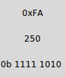
- class witkets.NumericLabel(master=None, numvariable=None, format='%.2f', number=0, **kw)
Label intended for displaying numeric values
- Options (all have default values):
numvariable — Numeric Tk variable to stock value
format — printf-like format to render number (plus %B and %H)
number — Number to show
All
Labelwidget options
- Forms of access:
>>> from witkets.numericlabel import NumericLabel,
>>> lbl = NumericLabel(format='%B')
>>> varLbl = IntVar()
>>> lbl.config(numvariable = varLbl)
>>> lbl['number'] = 200
- config(**kw)
Tk standard config method
- static format_bin(byte)
Bases binary data grouping nibbles
- static format_hex(byte)
Format number as hexadecimal
4.15. Plot (experimental)
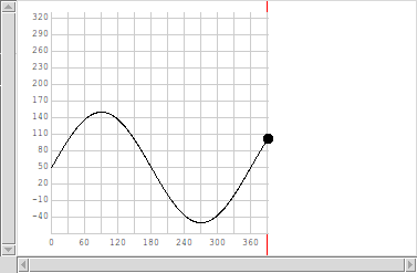
- class witkets.plot.Plot(master=None, xlimits=None, ylimits=None, autorange=False, xlabels='/5', ylabels='/5', labelsformat='%.2f', padding=None, labelsmargin=5, labelsfont='"Courier New" 9', boxlinestyle=None, gridlinestyle=None, **kw)
2D Plot with support for multiple series.
- Options (all have default values):
xlimits — Plot Window X limits (defaults to [-1,1])
ylimits — Plot Window Y limits (defaults to [-1,1])
xlabels — X axis labels (many configuration values, see below)
ylabels — Y axis labels (many configuration values, see below)
autorange — Autorange (single value or [xautorange, yautorange])
padding — Padding outside the plot grid (top, right, bottom, left)
labelsmargin — Margin for labels (single value or [xmargin,ymargin])
labelsformat — printf-like format to labels (single or compound)
labelsfont — The font used in tics (single or compound)
boxlinestyle — Plot window box style (
LineStyle)gridlinestyle — Plot window grid line style (
LineStyle)All
Canvaswidget options
Adding Curves
Once constructed, the method
add_plot()may be called to addPlot.Seriesinstances.Limits
The xlimits and ylimits parameters must be lists with the lower and upper bounds for the axes. Each one defaults to (-1 , 1)
These parameters are automatically changed when autorange is set. Autorange can be slow, since it will force a search for minimum and maximum values. It is either a boolean or a tuple with separate configurations for the axes.
Labels
Labels can be specified in several ways. If not supplied, xlabels and ylabels will INITIALLY be defined so that the plot grid has 5 lines in each axis.
1. Number of divisions Type: string Example: code:’/5’: (divide plot window in 5 intervals)
2. Fixed step in world coordinates Type: number Example: code:math.pi/2: (each interval at pi/2)
3. Custom values Type: list Example: code:[(2, “a”), (3, “b”), (5, “a+b”)] Another method is to completely customize labels, using the same parameters xlabels and ylabels. In this case, each one is a list of pairs where the first element is the label location in world coordinate and the second is the UTF-8 string to be rendered in that location. The grid divison lines will also be rendered in those locations.
For the first two modes, numeric labels are shown by default. The format may be adjusted using the labelsformat, which receives printf-like format strings or a pair of such strings, in the case of separate formats for X and Y axes.
Either way, the user must specify a margin from the plot box, by using the labelsmargin parameter. If one value is supplied, it is used for both X and Y axes. Another option is to pass a tuple with individual configurations for both axes. The margin is given in pixels.
The label font is specified with labelsfont. It can be also be a tuple for separate configuration for X and Y axes.
The padding controls the white space used to put the labels. It should be overridden with a list of four integer values, corresponding to top, right, bottom and left padding in that order. The size is given in pixels.
Line Styles
The default linestyle for the box and the grid may be overridden by specifying boxlinestyle and gridlinestyle. which are
witkets.plot.LineStyleinstances.- add_plot(series, redraw_all=False)
Add a plot series.
- clear()
Remove all curves from the plot and redraw.
- config(**kw)
Configure resources of a widget.
The values for resources are specified as keyword arguments. To get an overview about the allowed keyword arguments call the method keys.
- static get_config(axis, value)
Get configuration (shared value or separate values for each axis)
- redraw(*args)
Force a complete redraw (grid and curves)
4.16. PyText
- class witkets.pytext.PyText(master=None, text='', **kw)
Text view with syntax highlighting for Python code
- Options (all have default values):
All
Textwidget options
4.17. PyScrolledText
- class witkets.pyscrolledtext.PyScrolledText(master=None, text='', **kw)
Text view with syntax highlighting for Python code
- Options (all have default values):
All
Textwidget options
4.18. Ribbon
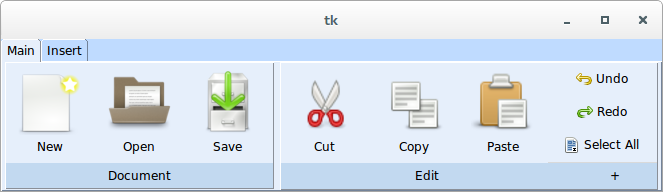
- class witkets.Ribbon(master, **kw)
Tabbed toolbar widget (MS Ribbon-like interface)
- add_tab(text)
Adds a new tab to the Ribbon
- Parameters
text (- text -- The tab) –
Returns: A RibbonFactory to create widgets on the tab just added
- remove_tab(index)
Removes a tab and all its children from the ribbon
- Parameters
erased (- index -- The index of the tab to be) –
4.18.1. Usage example
 1 import tkinter as tk
 2 import witkets as wtk
 3 root = tk.Tk()
 4 ribbon = wtk.Ribbon(root)
 5 tab1 = ribbon.add_tab('Main')
 6 group1 = tab1.create_h_group("Document")
 7 btn_new = group1.create_toolbar_item('data/document-new.png', 'New')
 8 btn_open = group1.create_toolbar_item('data/document-open.png', 'Open')
 9 btn_save = group1.create_toolbar_item('data/document-save.png', 'Save')
10 group2, btn = tab1.create_h_group("Edit", corner=True)
11 btn_cut = group2.create_toolbar_item('data/edit-cut.png', 'Cut')
12 btn_copy = group2.create_toolbar_item('data/edit-copy.png', 'Copy')
13 btn_paste = group2.create_toolbar_item('data/edit-paste.png', 'Paste')
14 btn_new['command'] = lambda: print('Hello, world!')
15 vgroup1 = group2.create_v_group([
16     ('test/edit-undo.png', 'Undo'),
17     ('test/edit-redo.png', 'Redo')
18 ])
19 tab2 = ribbon.add_tab('Insert')
20 tab2.create_toolbar_item('test/run.png', 'Run')
21 tab2.create_separator()
22 ribbon.pack(fill='x')
23
24 style = wtk.Style()
25 wtk.Style.set_default_fonts()
26 style.apply_default()
27
28 root.mainloop()
4.18.2. Styles
The following layouts are used by this widget:
Ribbon.TFrame
Ribbon.TNotebook
Ribbon.TNotebook.Tab
Ribbon.TButton
Ribbon.TLabel
RibbonBottom.TLabel
RibbonBottom.TFrame
RibbonBottom.TButton
RibbonGroup.TFrame
RibbonGroupInner.TFrame
4.19. Scope (experimental)

- class witkets.plot.Scope(master=None, plot_width=330, plot_height=220, screen_step=40, world_step=0.1, offset=0, autoscroll=True, highlightlast=False, padding=None, labelsformat='%.2f', labelsmargin=8, labelsfont='"Courier New" 9', gridlinestyle=None, **kw)
Multi-channel Signal Scope
Real-time plot with scrollbars.
- Options:
plot_width, plot_height — Plot dimensions
screen_step — Grid divison in pixels
world_step — Grid division in world coordinates (X,Y)
offset — Offset in world coordinates (X,Y)
autoscroll — Autoscroll to last point
padding — Padding outside the plot grid (top, right, bottom, left)
labelsmargin — Margin for labels (single value or [xmargin,ymargin])
labelsformat — printf-like format to labels (single or compound)
labelsfont — The font used in tics (single or compound)
gridlinestyle — Plot window grid line style (
Plot.LineStyle)plot_* — Pass other options to Canvas
All
Framewidget options
- - canvas --- The associated :code:`tk.Canvas` object
- - hscroll and vscroll --- Scrollbar objects
- class TicsIterator(scope, axis=0, start=None)
Tics iterator for (screen, world) tuples. scope — The scope object axis — Axis Index (X=0, Y=1) start — (screen, world) start point
For X axis:
|--|--|--|--|--|--|--|--|--|
|--|--|--|--|--|--|--|--|--|
|--|--|--|--|--|--|--|--|--|
1  2  3      ...           n
For Y axis:
n--|--|--|--|--|--|--|--|--|--|
 --|--|--|--|--|--|--|--|--|--|
3--|--|--|--|--|--|--|--|--|--|
2--|--|--|--|--|--|--|--|--|--|
1--|--|--|--|--|--|--|--|--|--|
- config(**kw)
Tk standard config method
- on_new_point(xw, yw)
Called by a ScopeChannel instance to update scope grid bounds.
4.20. Spin
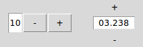
- class witkets.Spin(master=None, from_=0, to=100, step=1, numberformat='%d', variable=None, circular=False, orientation='horizontal', **kw)
Spin Box with features such as custom number formatting and orientation.
- Options (all have default values):
circular — Toggles circular increments and decrements
from — Minimum numeric value
orientation — Either tk.HORIZONTAL (default) or tk.VERTICAL (constructor only)
numberformat — The format applied to the number (default: ‘%d’)
step — Delta applied to the value when buttons are clicked
to — Maximum numeric value
variable — A Tk numeric variable to store the number
All
Framewidget options
- config(**kw)
Standard Tk config method
- get()
Sets the numeric value of the entry
- set(value)
Get the numeric value of the entry
4.21. Spinner

4.22. Tank
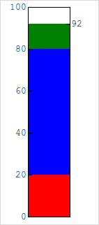
- class witkets.Tank(master=None, colorlow='red', colormedium='blue', colorhigh='green', hpad=0.2, levellow=20, levelhigh=80, maxvalue=100, minvalue=0, multicolor=True, number=50, numvariable=None, orientation='vertical', step=20, tickfont='"Courier New" 8', tickformat='%d', valformat='%.2f', vpad=0.1, **kw)
A gauge widget for measuring or setting level
- Options (all have default values):
colorlow, colormedium, colorhight — Colors for different levels
levellow — Value below which the level is considered low
levelhigh — Value above which the level is considered high
multicolor — Whether to show level ranges with different colors
number — Current value
orientation — Widget orientation (default is tk.VERTICAL)
numvariable — Tk variable to stock current value
tickfont — Font for showing ticks
tickformat — printf-like format to ticks
valformat — printf-like format to value
hpad, vpad — Widget padding (percentual)
minvalue — Minimum value (in world units)
maxvalue — Maximum value (in world units)
step — Ticks step (in world units)
All
Canvaswidget options (notably width and height)
If different colors are not desired, just set all three colors (low, medium and high) to the same value.
Example
>>> from witkets.Tank import Tank
>>> tank = Tank(maxvalue=140)
>>> tank['step'] = 50
>>> tank.config(number = 25)
- config(**kw)
Standard Tk config method
- disable_mouse()
Disables mouse events
- enable_mouse()
Enable mouse events
- screen2number(xscreen, yscreen)
Gets the level corresponding to a screen coordinate
4.23. Thermometer
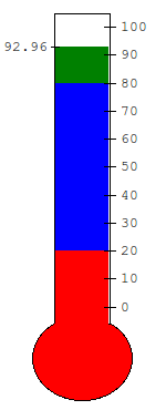
- class witkets.Thermometer(master=None, colorlow='blue', colormedium='green', colorhigh='red', levellow=20, levelhigh=80, number=50, numvariable=None, minvalue=0, maxvalue=100, step=10, hpad=0.2, multicolor=False, tickfont='"Courier New" 6', tickformat='%d', valformat='%.2f', **kw)
A vertical-oriented widget for measuring temperature
- Options (all have default values):
colorlow, colormedium, colorhigh — Colors for different levels
levellow — Value below which the level is considered low
levelhigh — Value above which the level is considered high
multicolor — Whether to show level ranges with different colors
number — Current value
numvariable — Tk numeric variable to stock current value
tickfont — Font for showing ticks
tickformat — printf-like format to ticks
valformat — printf-like format to value
minvalue — Minimum value
maxvalue — Maximum value
step — Ticks step
hpad — Horizontal padding (percentual)
All
Canvaswidget options (notably width and height)
If different colors are not desired, just set all three colors (low, medium and high) to the same value.
Example
>>> from witkets import Thermometer
>>> thermo = Thermometer(minvalue=32)
>>> thermo['ystep'] = 5
>>> thermo.config(number = 25)
4.24. ThemedLabelFrame
- class witkets.ThemedLabelFrame(master=None, title=' ', labelstyle='ThemedLabelFrame.TLabel', framestyle='ThemedLabelFrame.TFrame', **kw)
A frame with a title label, both themed
- Options (all have default values):
title — The text of the title label
labelstyle — The style applied to the title label
framestyle — The style applied to the frame
- Forms of access:
>>> from witkets import ThemedLabelFrame
>>> frm = ThemedLabelFrame(title='Test')  # initializer
>>> frm['title'] = 'Test 2'               # dict-like
>>> frm.config(title = 'Test 3')          # config method
- config(**kw)
Standard Tk config method
4.25. TimeEntry
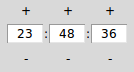
- class witkets.TimeEntry(master=None, seconds=True, **kw)
Entry for inputting time (hours, minutes and seconds)
Convenient widget that combines 3 spins and 2 labels to compose an entry suitable for inputting time.
- Options:
seconds — Whether to show the seconds spin (constructor only)
All
Framewidget options
- get()
Gets the time stored in the widget as a tuple (hours, mins, secs)
- set(hours, minutes, seconds)
Sets the time stored in the widget
4.26. ToggleButton
4.27. Toolbar
